Concept app · 2025
SustainaBite
A concept app and brand identity helping young professionals eat sustainably without sacrifice — built on a year of research into why values and behavior come apart at dinnertime.
Methods
Literature Review · Competitive Audit · Visual Analysis · Brand Identity · Wireframing · Prototyping
Team
- Teresa Edward Michael — Lead designer & researcher
The problem
Young professionals want to eat more sustainably — but life gets in the way. Between long hours, limited budgets, and an overwhelming stream of content, sustainable choices fall apart in favor of convenience.
Sustainability Without Sacrifice: Rethinking Convenient Eating for Young Professionals. A year-long, self-directed UX research and design project — concept app, brand identity, and behavior-change campaign — built end-to-end from literature review through high-fidelity prototype.
Read the research paper → · View the design deck →
The audience
The primary audience for this research includes educators, designers, policymakers, and developers working in sustainability, nutrition, and food systems. But the group that stands to benefit most directly is young professionals themselves — especially those navigating early adulthood, busy lifestyles, and financial limitations while trying to make healthier, more sustainable food choices.
The research
I built the case for SustainaBite through a literature review, three food-tech case studies, and visual analyses of the leading consumer-facing platforms — Too Good To Go, Misfits Market, Olio, and Imperfect Foods.
The pattern that emerged across all of it was unanimous:
The most successful platforms in the space rely on storytelling, visual cues, and habit-forming design. The least successful lecture, shame, or assume time their users don’t have. SustainaBite was built to live in the first group.
The brand
I designed the SustainaBite identity to be the foundation for the app — a tone of voice and visual system that would stay consistent across product, marketing, and packaging.
From the visual analysis of competitors, approachability emerged as the design lever. When sustainability messaging feels guilt-driven, people tune out. The brand was built to do the opposite: positive, clear, and empowering — flexibility, accessibility, and progress over pressure.
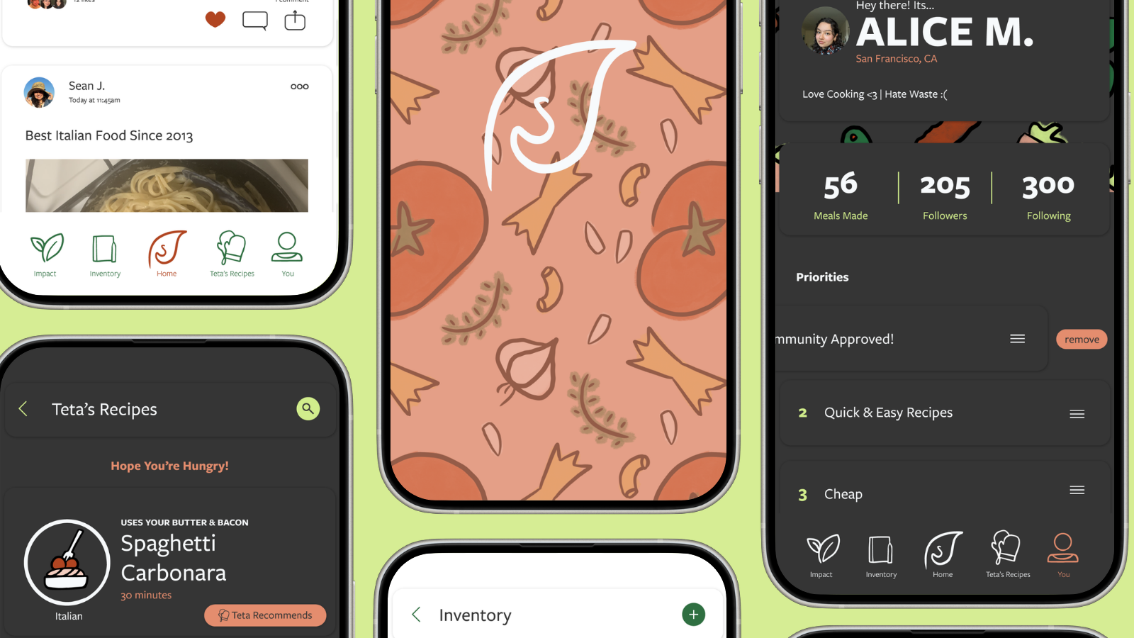
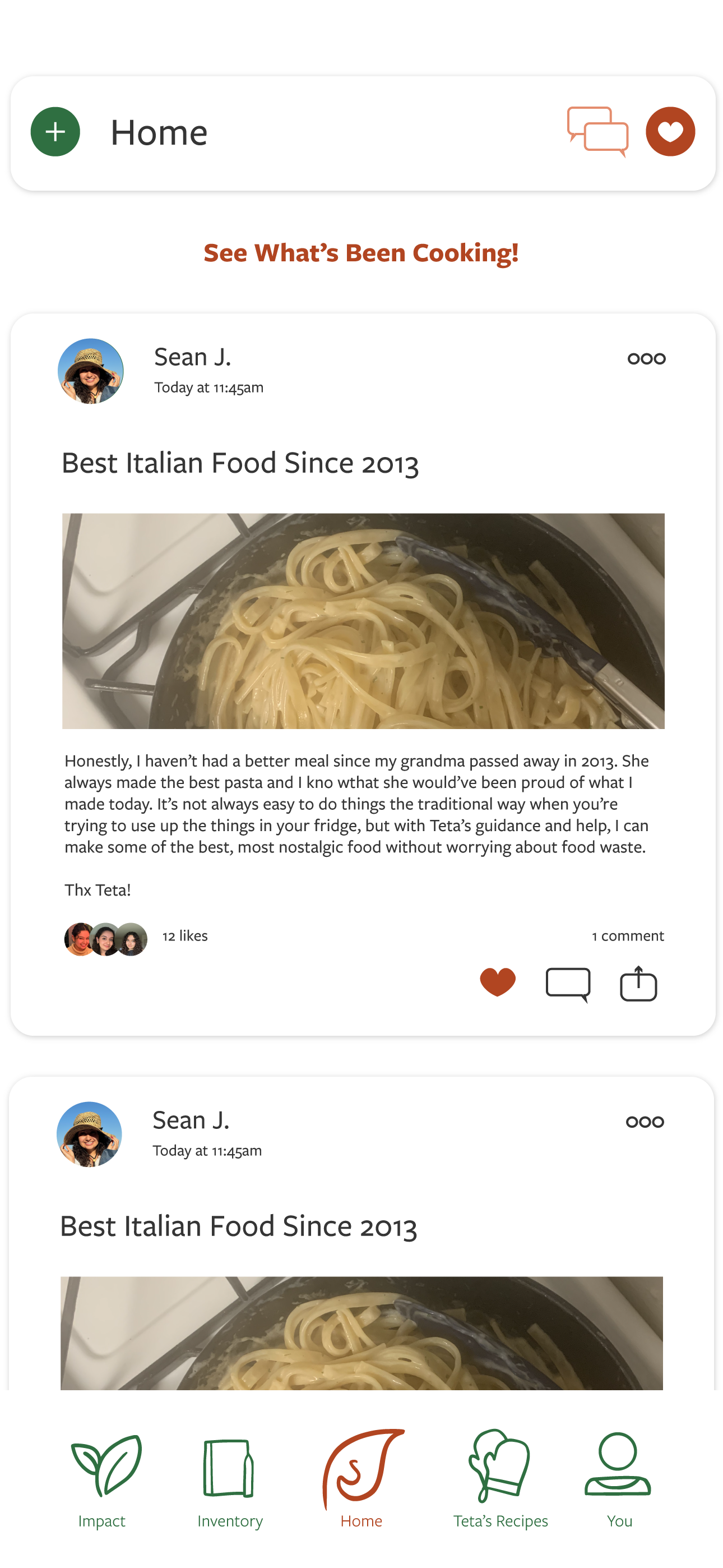
The app
A concept app organized around three lived friction points: keeping track of what’s already in the kitchen, understanding what makes food choices “sustainable,” and seeing real-world progress without shame.
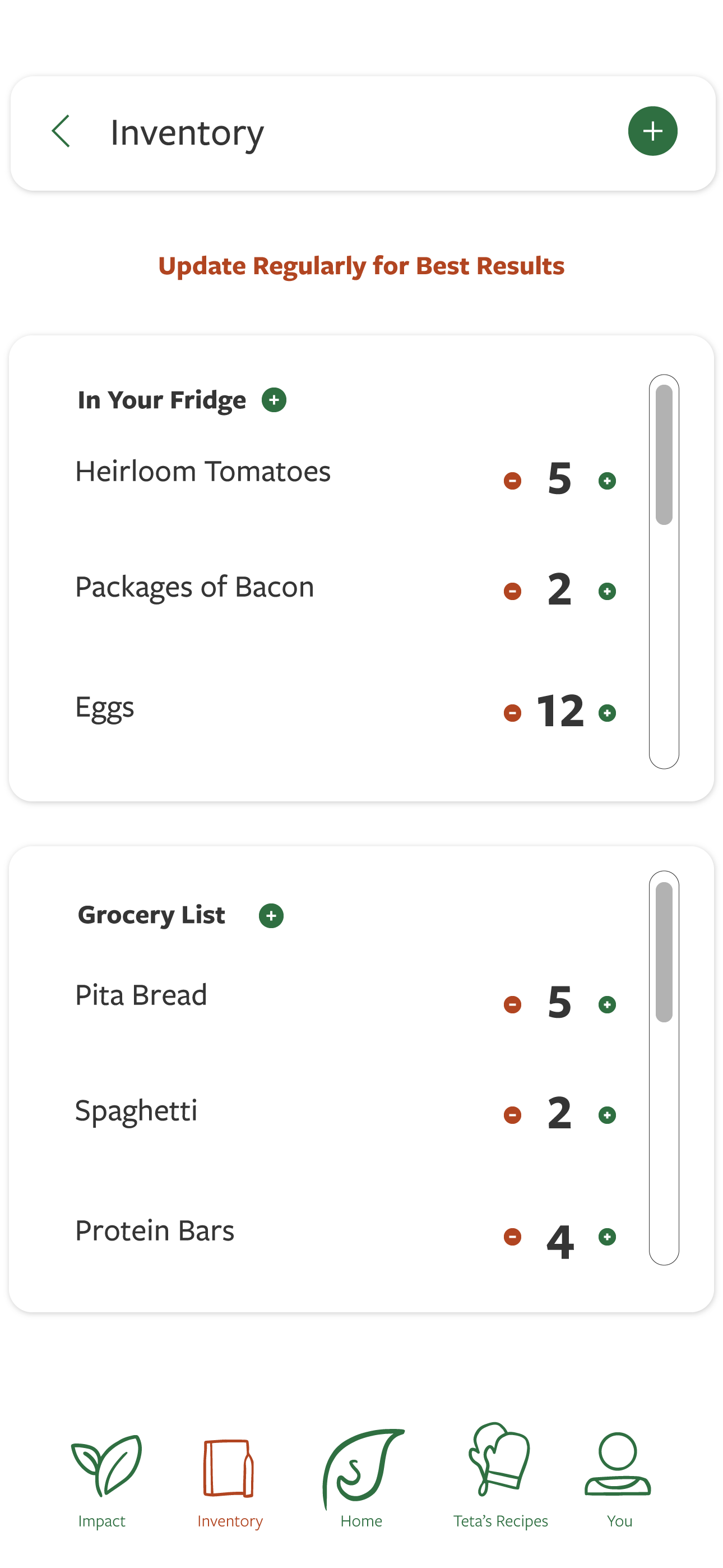
Inventory is a low-friction way to keep up with what’s in the fridge — the literature points to forgetting what’s on hand as the single biggest predictor of household food waste.
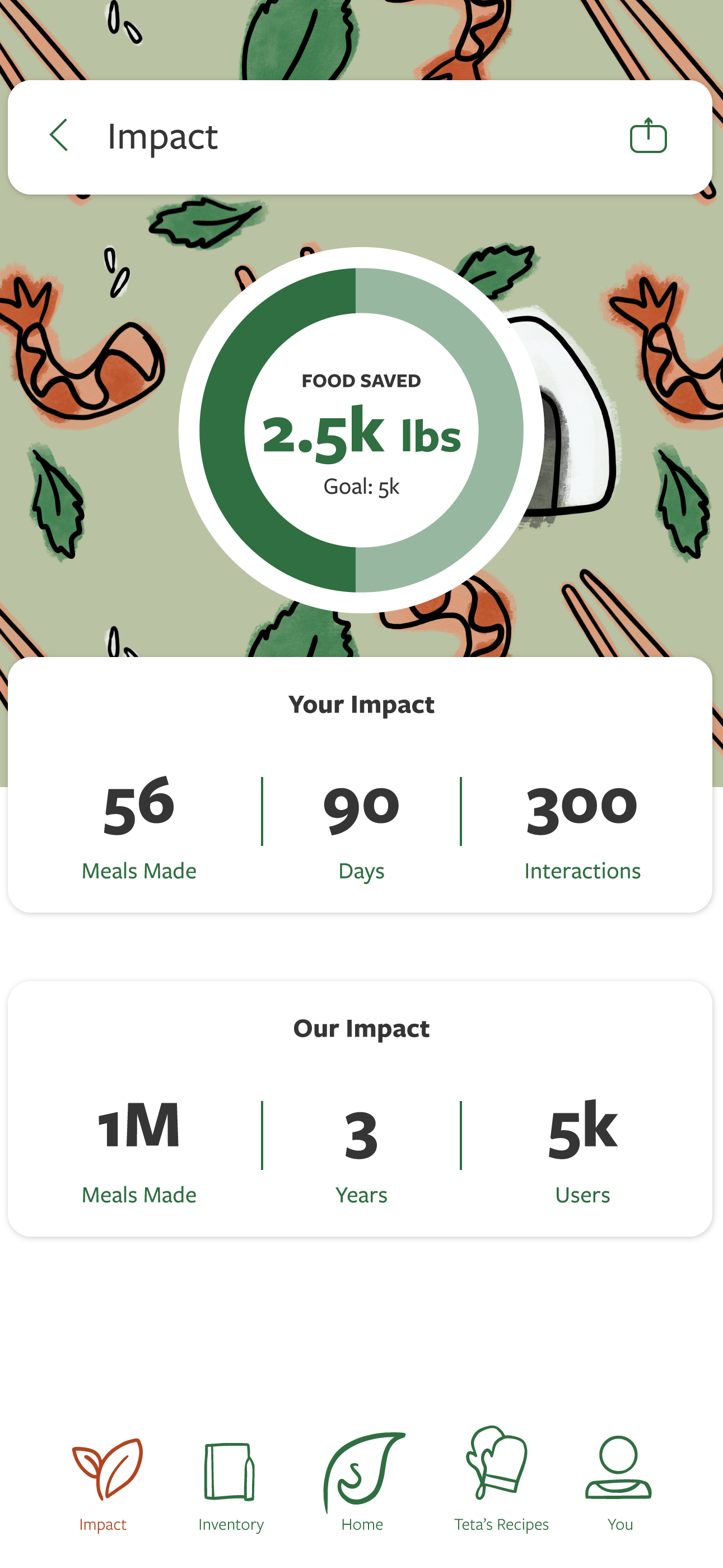
Impact is a softer scoreboard. Same data as a “you wasted X pounds this week” report, reframed around progress and percentage of food used. Designed for the third week of using the app, not the first day.
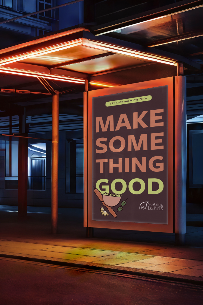
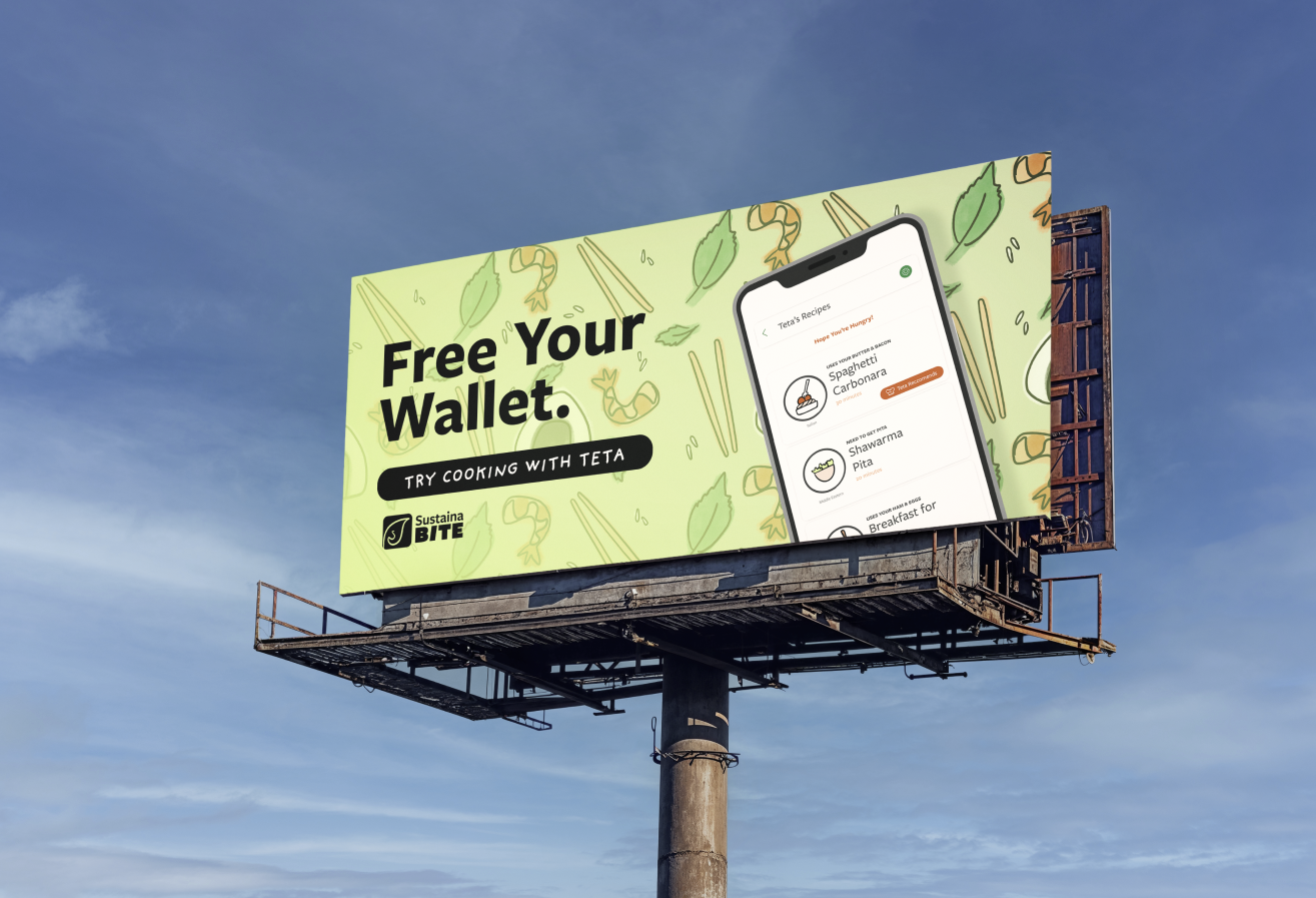
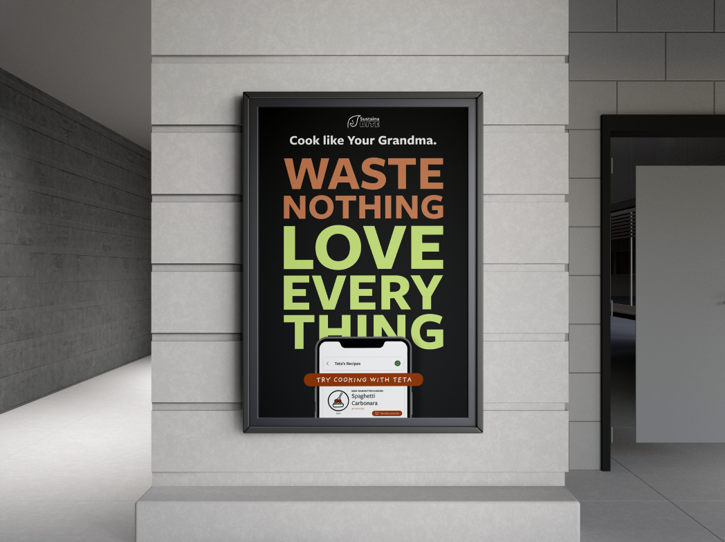
The campaign
Three lateral nudges — campaign concepts for how SustainaBite would show up in the world beyond the app itself.
Decisions
- Approachable over moralistic. The competitor analysis was unanimous: guilt-driven messaging underperformed every time. Every brand and copy choice was tuned to do the opposite — flexibility over pressure, progress over shame.
- Three friction points, not five. The literature pointed to several places sustainability falls apart for young professionals; I scoped to the three it called out most consistently — what’s in the kitchen, what makes a choice sustainable, and progress without shame. Cooking skill and dietary restriction came up and stayed out of scope so the core loop could land.
- Impact dashboard reframed as progress. Same data as a “you wasted X pounds this week” report, designed instead around percentage of food used. Built for the third-week user — momentum reads better than guilt.
- A concept, not a half-shipped app. A one-person project without engineering or live users — I chose a high-fidelity concept plus brand system over a thinly-built prototype. The next thing I’d want from this is real user data — see below.
What’s next
A connected version. The impact dashboard is currently personal — but sustainability is more often a household behavior than an individual one. A version that lets two roommates see “our” waste together would likely produce more durable change than the solo version.
Impact in context
- Year-long UX research and concept development across three food-tech case studies and four consumer platform analyses.
- Brand identity, style guide, and concept app — research-backed, end-to-end.
- Findings published in academic Digital Commons for educators and designers working in food systems.