UX · 2024
Economic Impact Study
A national economic dataset translated into something local — an interactive map and 50 state-level PDF templates that let a policy staffer find their state, their numbers, and their story in under a minute.
Methods
Information Architecture · User Flows · Wireframing · Prototyping · Design System
Team
- Veronica Nigh — TFI Chief Economist
- ComplEat Analytics — Economic modeling & analytics
Live
View live →The problem
How do you make national economic data meaningful at a local level? National numbers are rarely persuasive. Local numbers almost always are. The challenge: how do you make a single dataset feel like 50 personal letters?
I led design direction and the visual system for the downloadable, state-level PDFs that sit inside The Fertilizer Institute’s Economic Impact Study — an interactive map showing how the fertilizer industry contributes to each state’s economy. The work was done in close collaboration with Veronica Nigh, TFI’s Chief Economist, and the modeling team at ComplEat Analytics.
The design challenge was translating dense economic modeling into one-page summaries that policymakers, industry stakeholders, and the public could understand at a glance.
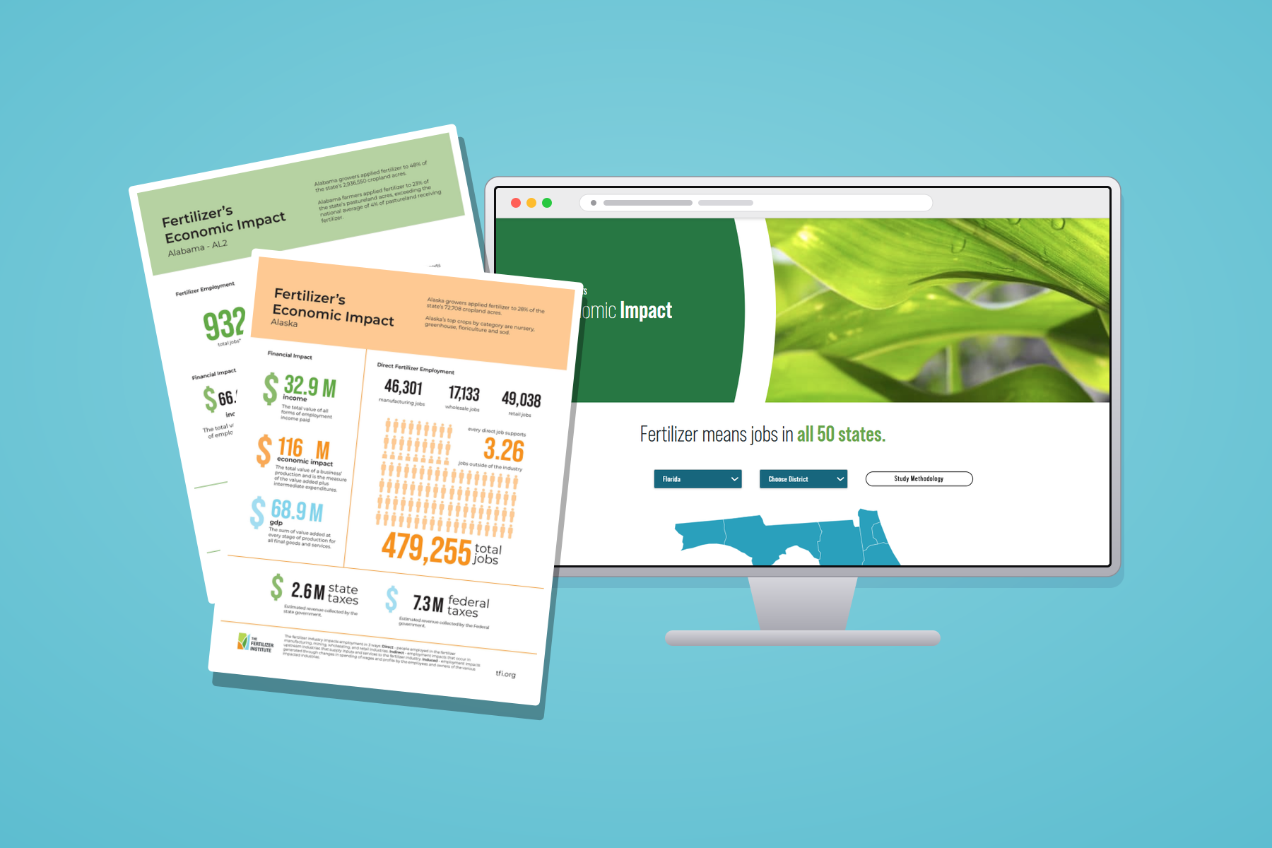
The interactive map
The live, shipped product — pick a state, get its story. Fully interactive, embedded right here.
The map is the entry point — pick your state, get your story. From there a visitor can download a one-page PDF specific to their region, designed in the same visual language as the live map experience.
State and district templates
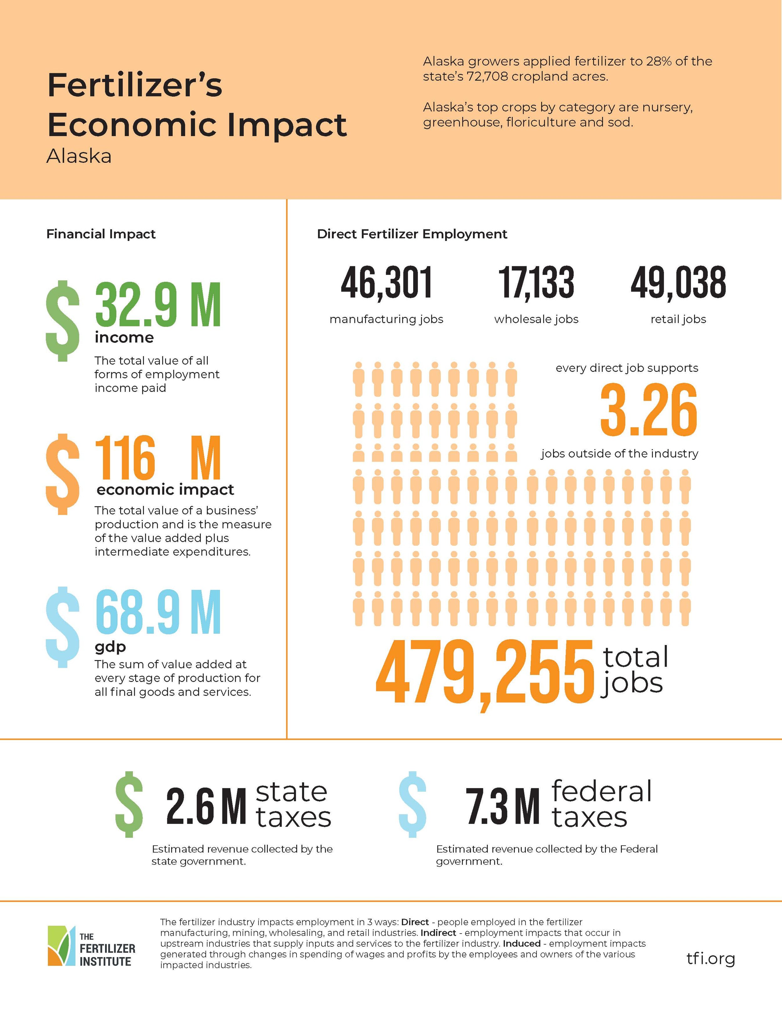
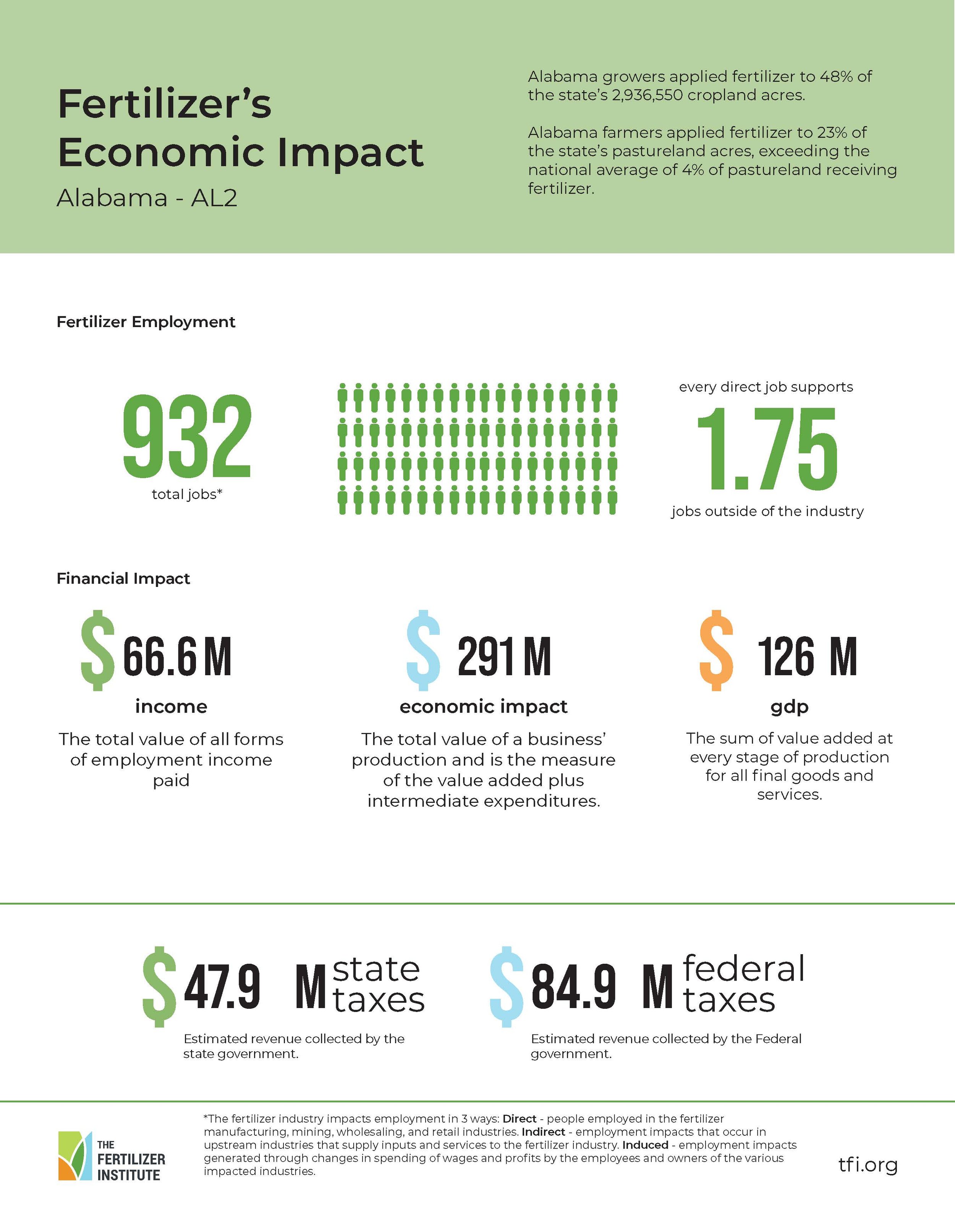
Each state gets its own one-page PDF — same visual system, different numbers. Districts and congressional breakouts use the same structural grid, so a policy staffer can swap from a state view to a district view without re-learning the page.
Decisions
- Lead with the consequence, not the methodology. The economist and analytics team owned the model. My job was making the finding findable in under a minute — the methodology lives inside the report itself for analysts who want it.
- Same structural grid for state and district views. A policy staffer shouldn’t re-learn the page when switching from their state to their congressional district. One template, swappable data — even when the visualization had to change.
- The PDF carries the same visual story as the live map. Half the audience prints things. The downloadable artifact had to be the same experience as the interactive one — not a flattened compromise.
What I’d do differently
- Establish visualization standards early. Data-heavy projects benefit from locking in chart types, hierarchy, and labeling at the start to streamline later production.
- Tighter coordination, sooner. Closer collaboration between analysts and designers earlier in the process prevents rework when translating technical findings into visuals.
- Even analytical audiences appreciate storytelling. Strong visual narrative improves clarity without sacrificing rigor — the dataset doesn’t have to lose its weight to become legible.
Impact in context
- Translated dense economic modeling and state-level data into clean, readable one-page summaries that made the findings easier to grasp at a glance.
- Designed a consistent visual system for the PDFs that worked seamlessly within the larger interactive map experience.
- Collaborated closely with the economist and analytics team to ensure the design accurately reflected the methodology and findings.