Editorial · 2025
Sustainability Report
An interactive sustainability report that translates a year of industry progress data into an accessible narrative — one a non-specialist can understand in ten minutes.
Methods
Stakeholder Mapping · Workshops · Editorial design · Art direction
Team
- Nimble Communications — Design and production
Live
View live →The problem
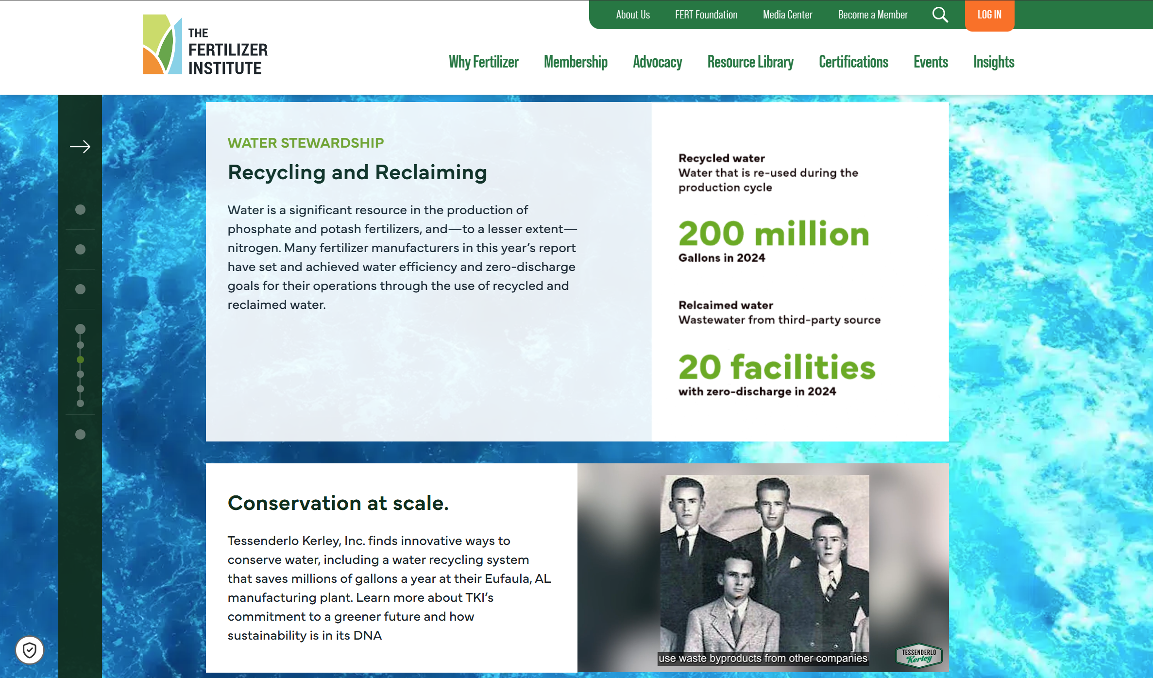
How do you showcase a year's worth of sustainability progress across an entire industry without burying it in charts? The answer turned out to be: stop treating the data as the destination, and treat it as the proof.
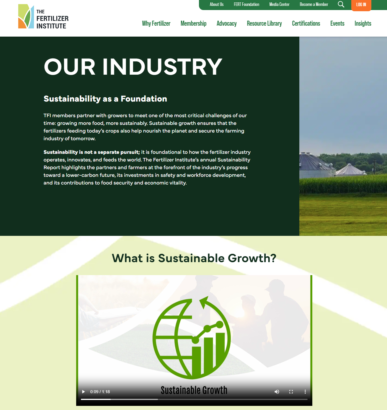
I led the client-side creative and art direction for The Fertilizer Institute’s 2025 Sustainability Report — an industry-wide, interactive view of progress across emissions, stewardship, and innovation. Design and production was a collaboration with Nimble Communications.
The brief: a year’s worth of data, made legible and emotional in a single scroll.
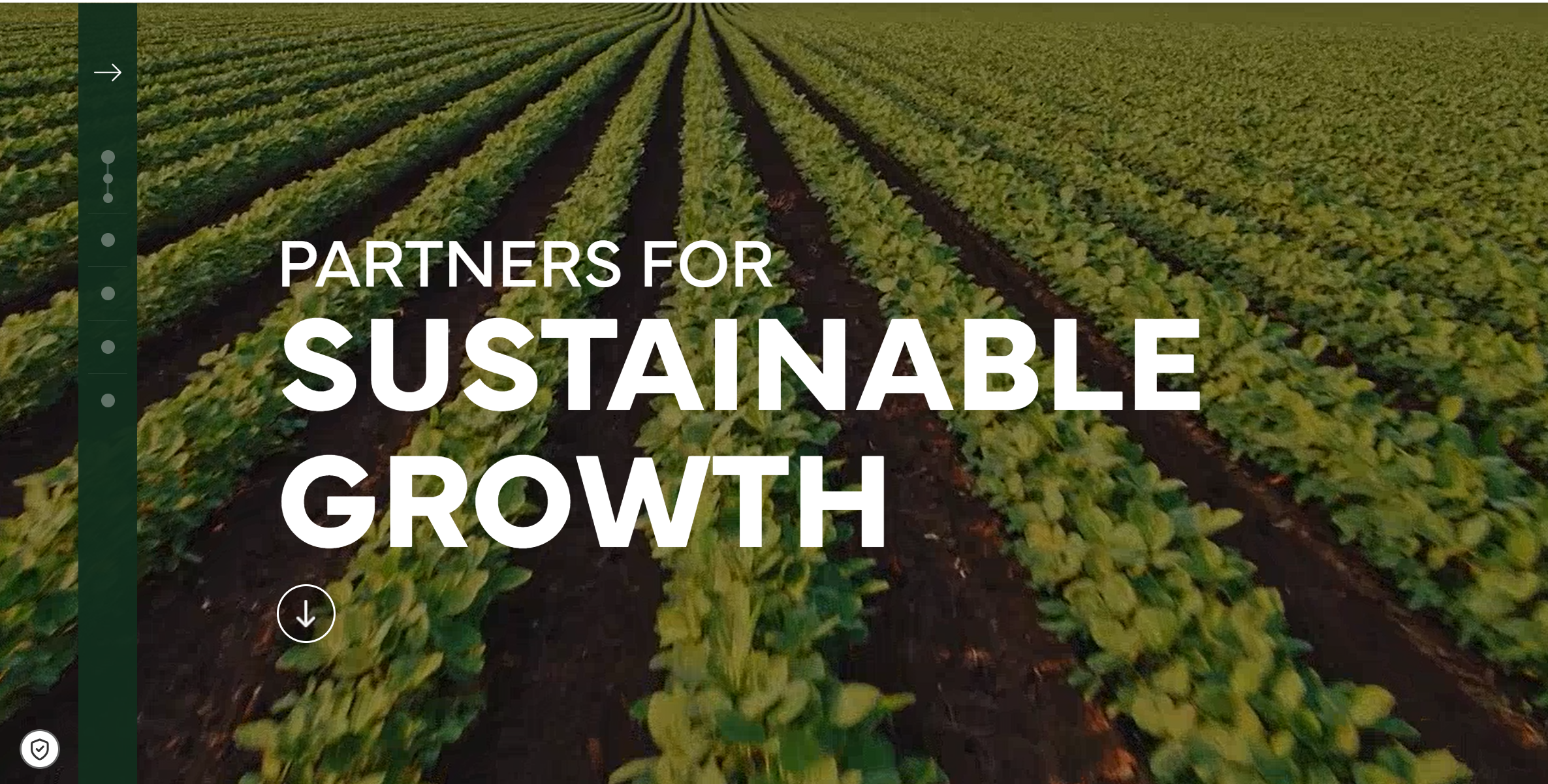
The report
Decisions
- Story over chart count. With more data than would fit in a single scroll, I cut metrics rather than crowd the page — only what served the year’s argument stayed.
- One continuous scroll, not a paginated format. A non-specialist had to be able to finish in ten minutes. The single-scroll structure forced editorial discipline a paginated format would have let us avoid.
- Visual direction locked in week one. With multiple internal stakeholders and an agency producing the work, late revisions are the cost of indecision early. Settling direction up front prevented a month of churn later.
What I’d do differently
- Align on story and priorities earlier. With so many possible metrics and inputs, defining the narrative upfront would have streamlined later design decisions.
- Build structured checkpoints into the timeline. Feedback should consolidate at known moments rather than arrive from multiple directions throughout.
Impact in context
- Translated complex industry sustainability data into a narrative that was easier for non-technical audiences to understand.
- Established a clear visual direction early, which helped align internal stakeholders and the design team.
- Successfully coordinated across multiple contributors to turn a large volume of information into a cohesive report.