Brand · 2024
Certified Biostimulant
Brand identity for an industry-wide certification program — built to live equally well on a 40-acre field sign, a regulatory document, and a product label.
Methods
Workshops · Competitive Audit · Brand Identity
Live
View live →The problem
Certification marks live in adversarial environments — bagged products on store shelves, regulatory PDFs, dusty trade-show booths. The mark needed to read instantly across all of them, while still feeling like a promise rather than a stamp.
A certification designed for one of the most innovative parts of the fertilizer industry. The mark and its accompanying brand system needed to communicate trust and rigor across every surface a Certified Biostimulant might appear — from bagged product labels in retail, to regulatory filings, to industry trade-show booths.
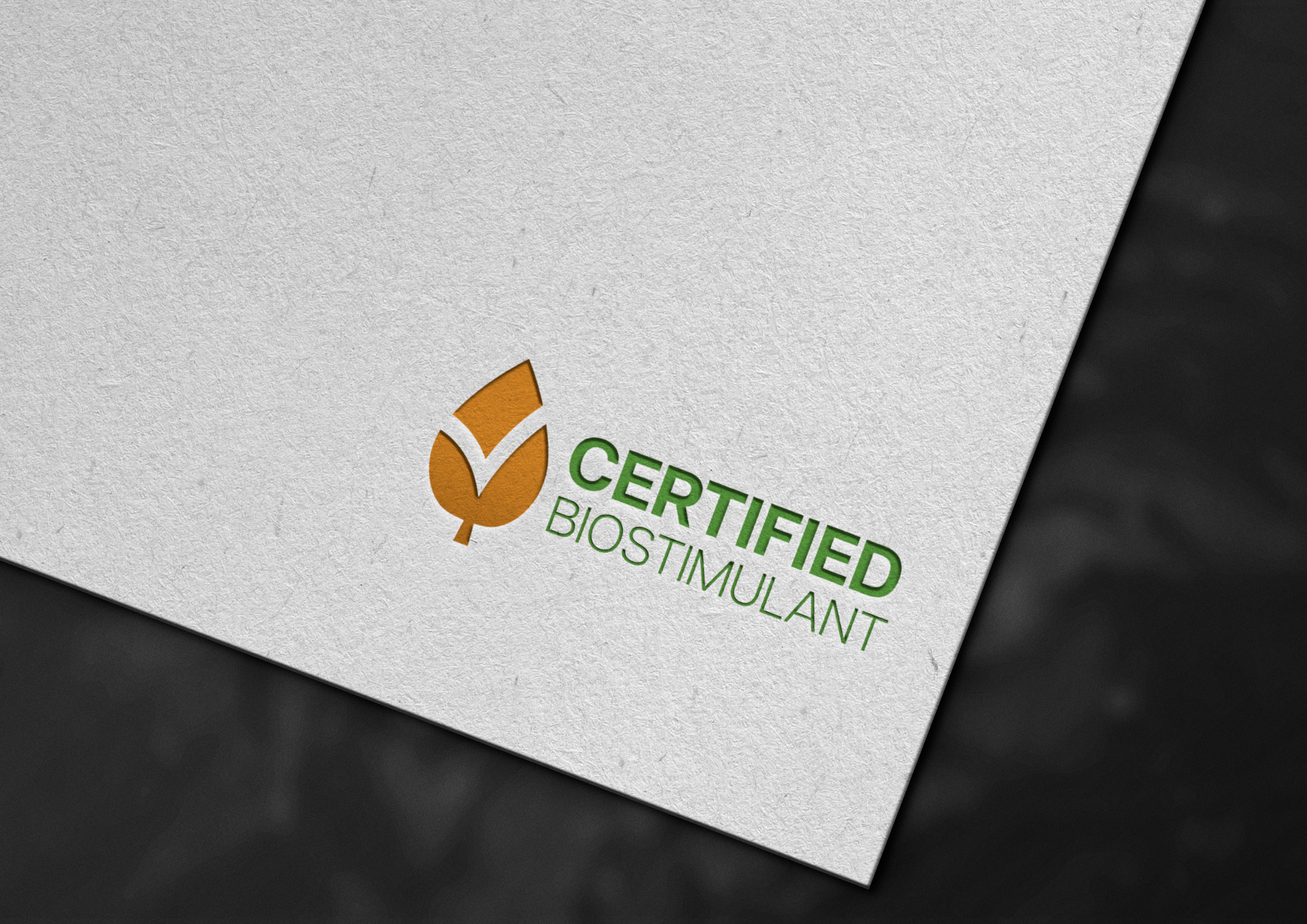
The mark
A balanced identity engineered to read instantly at a glance and hold up at any scale — from a 12pt regulatory footnote to the side of a forty-pound bag.
The certificate
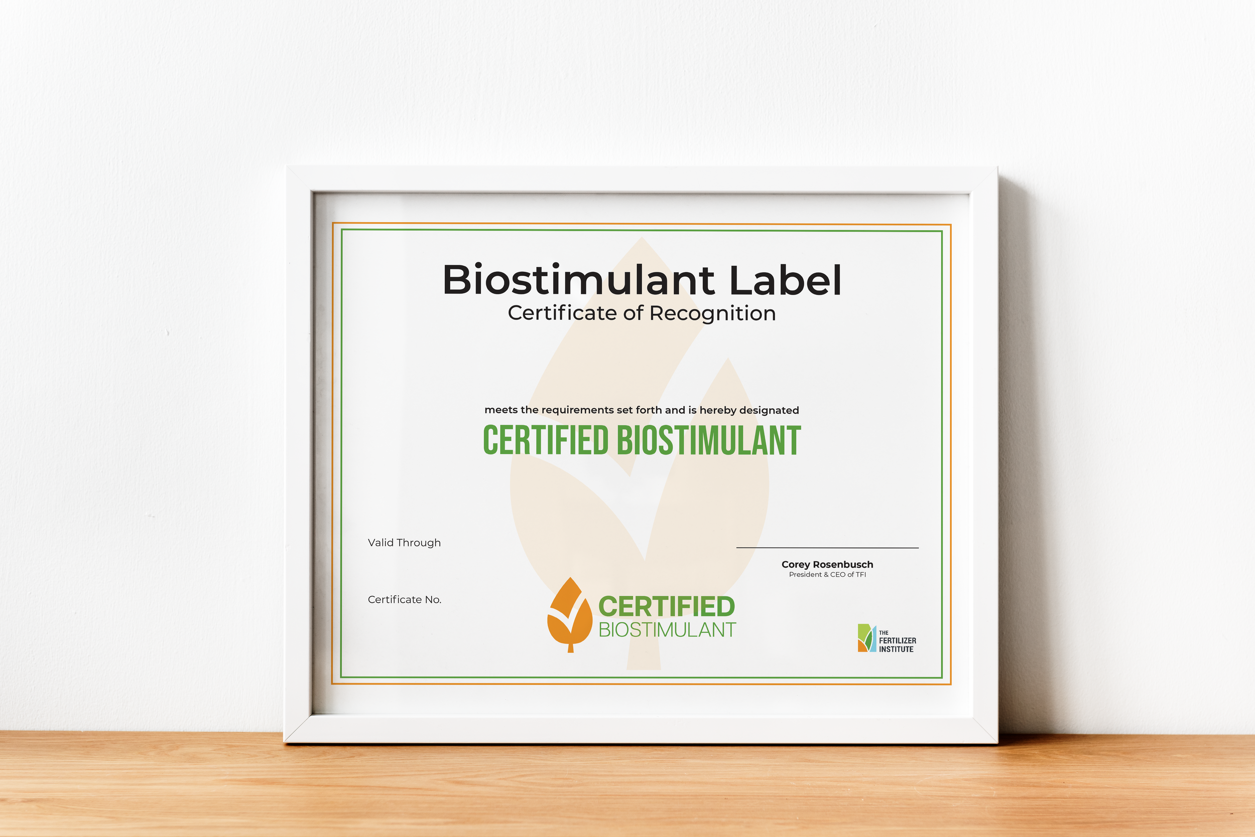
The certificate is the formal artifact organizations receive — built on the same brand system as the consumer-facing mark. The visual continuity from store shelf to filing cabinet was the point.
Decisions
- Designed for the adversarial surface first. A 40-pound bag in a feed store is a harder context than a brand guidelines PDF. Every weight, hierarchy, and proportion choice was made for the harder surface; the easier ones came along for free.
- A promise, not a stamp. Most certification marks read like compliance — sharp seals, regulatory geometry. This one was built to feel earned: softer corners, tighter type, a wordmark that holds its own without the seal.
- One system across consumer and regulatory contexts. It would have been faster to fork the design — a consumer-facing mark for product, a more formal version for filings. I refused. The continuity from store shelf to filing cabinet was the point of the program, and the design had to reflect that.
Impact in context
- In-market across participating product lines — bags, marketing materials, and presentations now use the system.
- Brand guidelines licensed to certifying organizations as the canonical asset.
- Trademark currently pending on the logo.